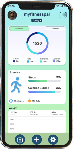
MyFitnessPal App Redesign
A redesign of the mobile health app Myfitnesspal to make it more user friendly.

About the project
Problem Statement
After testing and evaluating the MyFitnessPal app, we discovered that it suffers from multiple issues, including bloated features, a confusing interface, and limited scope on some of the pre-existing features.
The Goals
Cleaning up the user interface
Building out some of the more important features
Removing any of the bloated features that do not see regular use
Key Features
Skills Used
User research, Prototyping, Collaboration, Usability testing, Competitive analysis, and Project management
Our design incorporates three key features: macro and calorie logging, weight tracking, and exercise tracking. These features address users’ needs by presenting a simplified, intuitive interface that focuses only on the most essential information, avoiding the confusion often caused by cluttered layouts.
Design Process
Potential Touch Points
To redesign MyFitnessPal, we followed a structured UX process that combined research, analysis, ideation, and prototyping. Each step was aimed at understanding users’ needs, identifying pain points, and creating a streamlined experience that emphasizes core functionalities.
Competitive Analysis
We began by analyzing similar fitness and wellness apps to understand industry best practices. This helped us identify both strengths and weaknesses in MyFitnessPal’s design, as well as opportunities for improvement. Key activities included:
Examining competitor features, user interfaces, and navigation patterns.
Assessing usability strengths, such as advanced nutrition insights.
Highlighting weaknesses, like inconsistent platform integration.
Identifying opportunities for innovation and differentiation.

User Journey Mapping
Next, we created a detailed user journey map to explore how users interact with MyFitnessPal throughout their experience. Mapping key stages—Consideration, Research, Getting Started, Logging Progress, and Next Steps—allowed us to uncover inefficiencies and friction points. Through this, we gained insights into:
Users’ primary objectives and motivations.
Daily interaction patterns with the app.
Opportunities to simplify workflows and reduce cognitive load.

Brainstorming & Concept Development
With research insights in hand, we ideated design solutions to improve layout, navigation, and user flow. Key concepts included:
Improved Meal Tracking: Redesigned the meal tracking interface with expandable cards for Breakfast, Lunch, and Dinner for better organization.
Simplified Layout: Removed unnecessary or rarely used features, focusing on core functionalities like logging and progress tracking.
Aesthetic Overhaul: Updated the color palette, typography, and overall visual hierarchy to create a calm, engaging, and user-friendly interface.

Figma Prototyping
High-fidelity prototypes in Figma allowed us to visualize interactions and test usability before implementation. Key steps included:
Designing screens that reflected the updated user flow and prioritized features.
Simulating interactions to observe how users engage with the redesign.
Iterating designs based on feedback to ensure clarity, ease of use, and visual appeal.
User Feedback
Multiple rounds of user testing confirmed that the redesigned app significantly improved the user experience. Feedback highlighted:
Preference for the simplified layout and cleaner interface.
Appreciation for the new color scheme and refreshed aesthetic.
Increased ease of navigation and overall engagement with core features.