Airborne
A connected, modern, and personalized in-flight entertainment system.
About the project
Brief
Create a universal in-flight entertainment system, which can be used by every airlines, across all devices and screen sizes.
Back when I first started flying, in-flight entertainment was better than anything you could bring onto a plane and it was also considered a huge luxury to have onboard. Now, those systems are often outdated, hard to upgrade and very expensive to support. Not to mention that they're prone to error and not as sensitive to touch as modern touchscreens are and should be.
The Challenge
Research
User Research
To start the process, I conducted a poll with friends and followers across social media, related to flying and in-flight entertainment. I managed to get a good variety of people to participate, however, the majority are younger, 18-30, so it would be harder designing for older passengers.
Deductions from the above user survey:
18-25 y/o fly with cheap airlines with no IFE and they would prefer to use their own device.
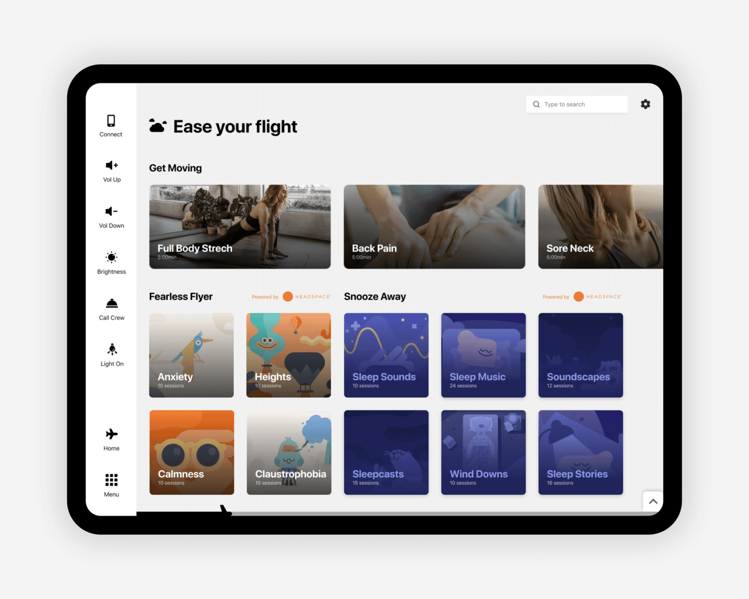
A lot of people struggle physically and/or mentally during a flight.
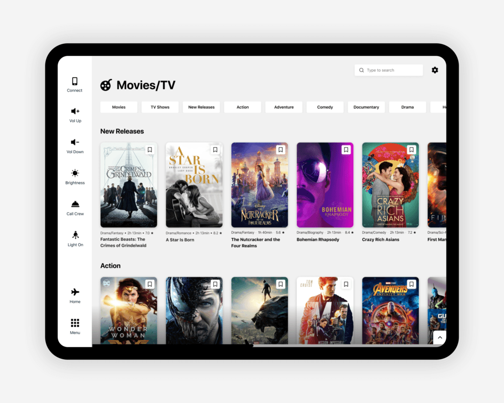
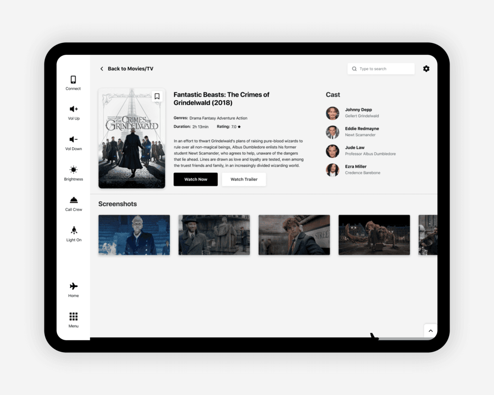
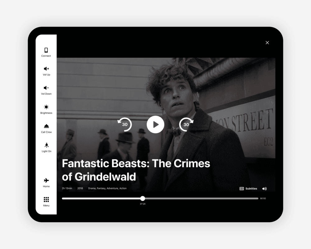
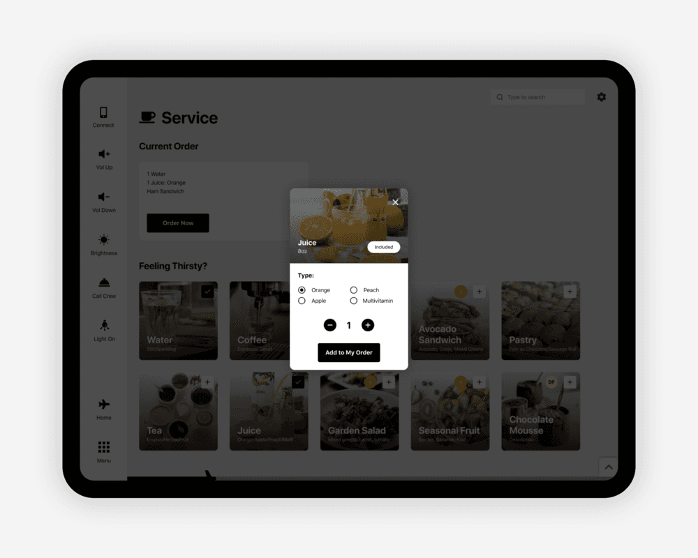
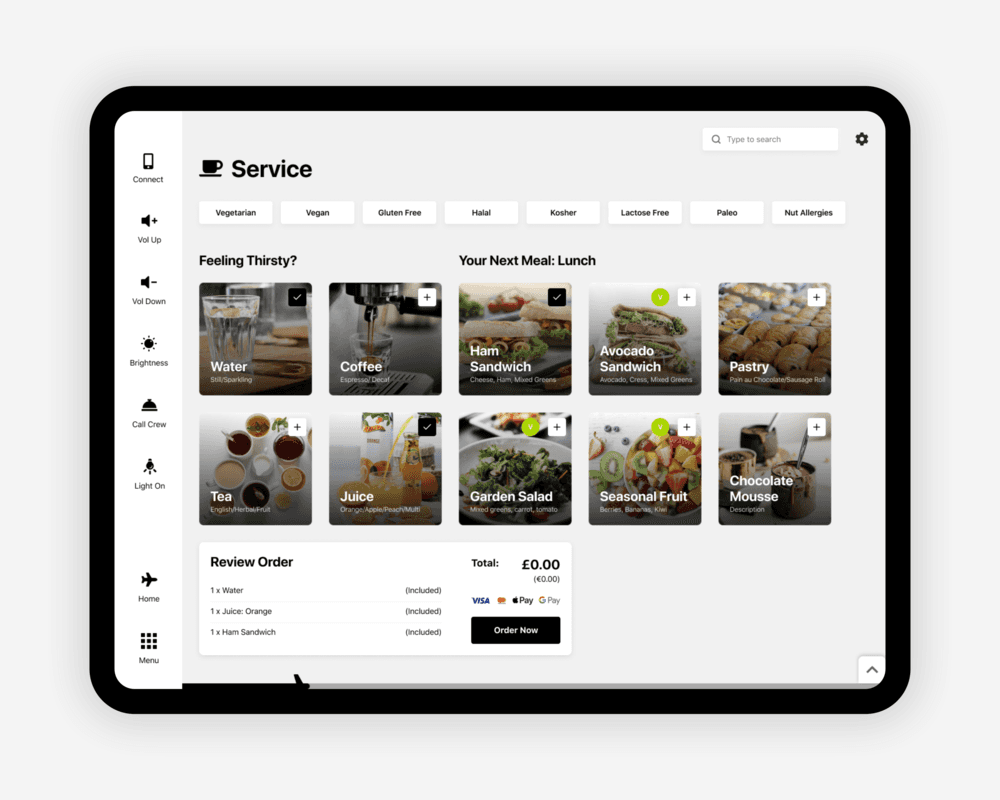
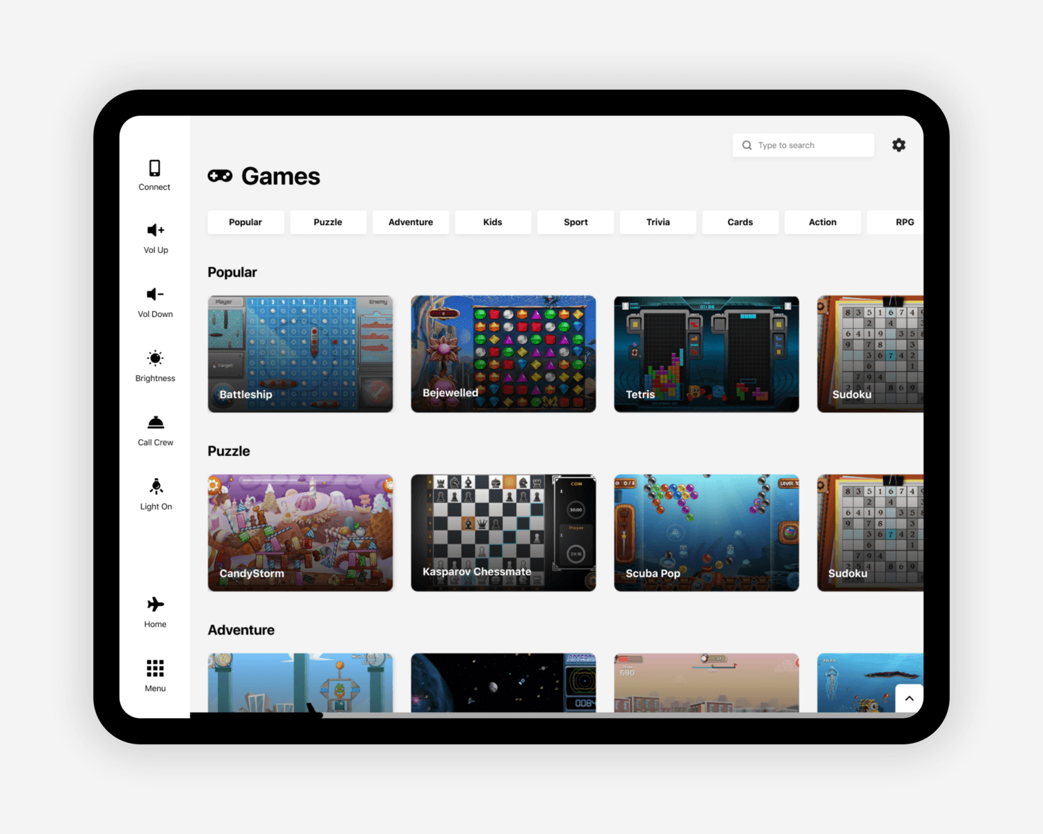
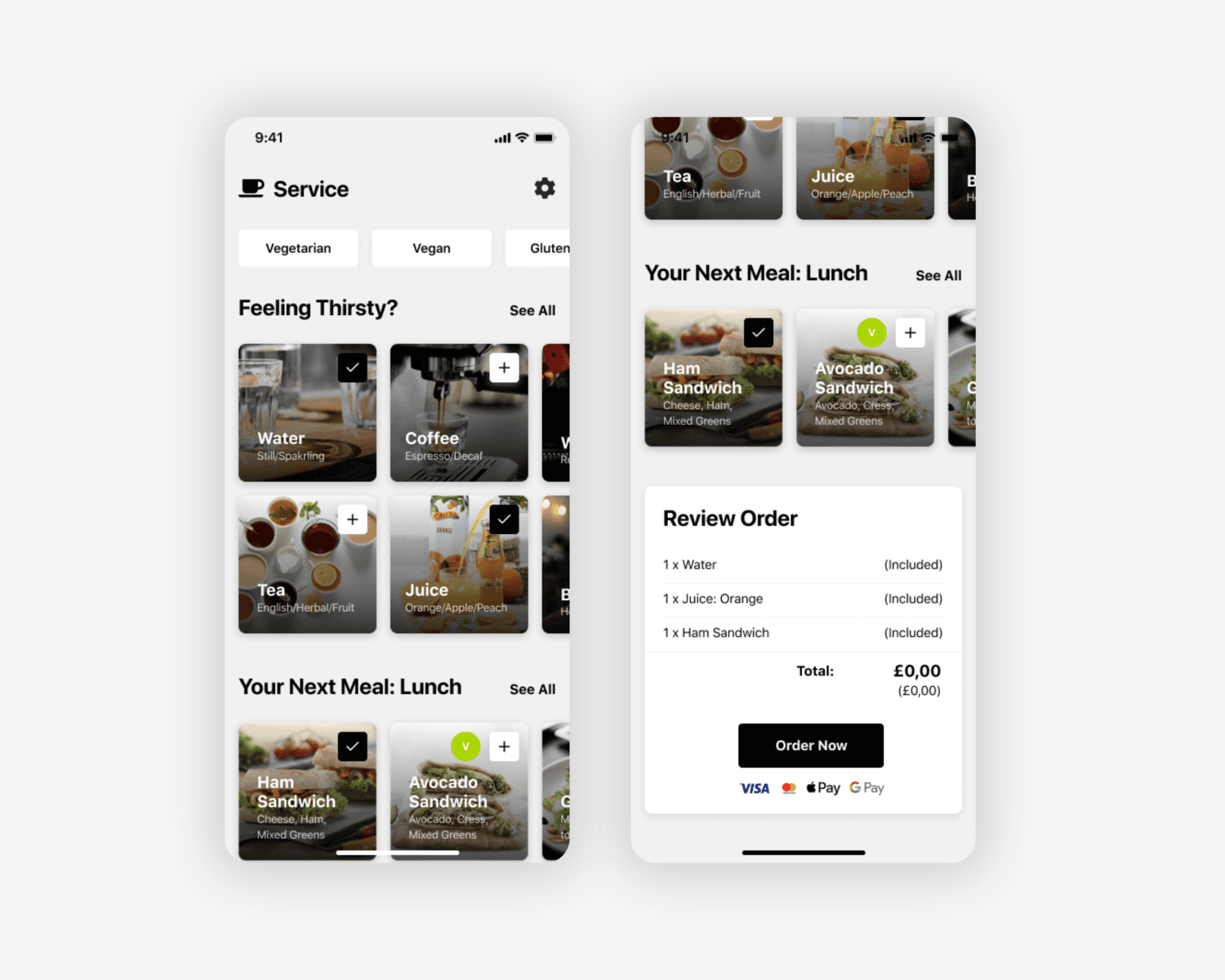
The main feature passengers use the system for streaming movies and music.
30+ y/o still prefer the integrated tablet
What current IFE Systems lack
Apart from plain UI issues, IFEs turned out to have a lot of gaps and holes to fill.
Amongst the people I interviewed, a big percentage shared that they have physical and mental struggles during a flight / related to flying - something that current systems don’t have. Despite them focusing on ‘entertainment’, the wellbeing of passengers should be something airlines are thinking about. On the same note, none of the existing IFEs offer any settings towards accessibility - practically making it completely useless for a significant amount of passengers.
Here’s what I added to the IFE system and why
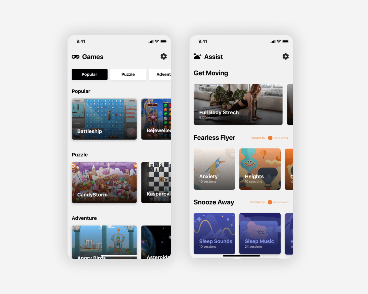
Assist page (mentioned above): Offers stretches and cabin exercises, as well as meditations/casts/animations, etc. to ease anxiety/claustrophobia/fear of flying.
Accessibility features: As part of the app settings, provides options for color themes, voice control, color filters, dynamic type, etc.
Connected Experience: Different passengers have different expectations. There is no need to completely omit integrated hardware. Devices can work collaboratively - connecting them will allow them to excel at what they do best, but also have a fallback for passengers who don’t have a phone. By introducing a ‘connect’ feature, the user has the ultimate freedom to decide how they’re using the system - on a provided device, on a personal device or on both.
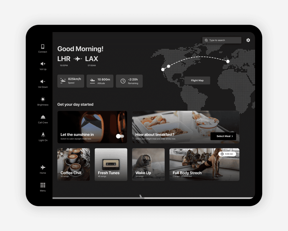
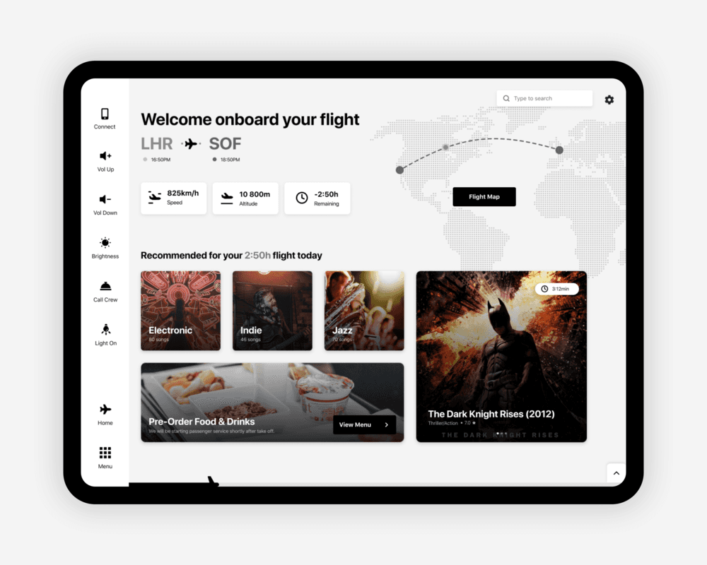
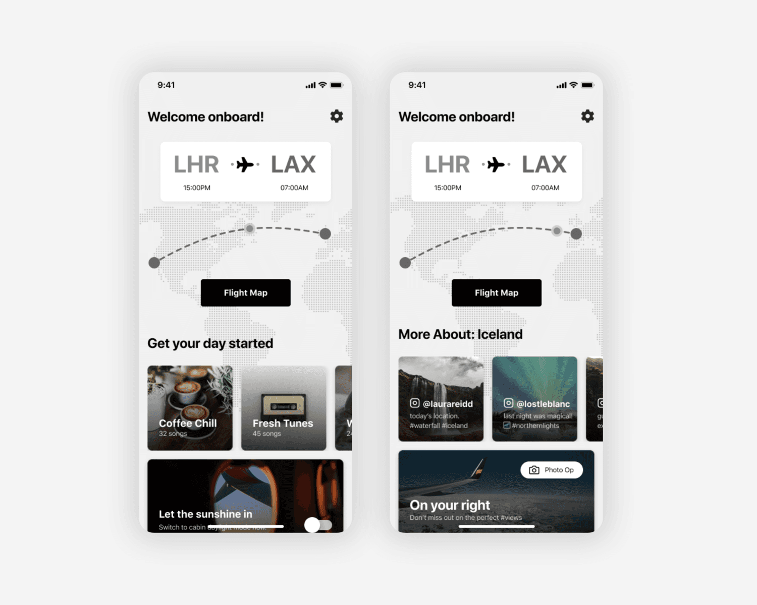
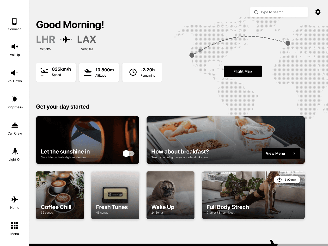
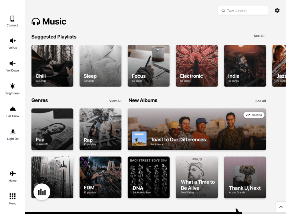
Personalized Home Screen Recommendations: Home screens are usually very random - there’s little to no hierarchy and no particular reason you’re seeing what you’re seeing. Adding recommendations based on different properties would utilize the page and make it more valuable to the users.
Time-Based Recommendations: Day/Night (ex: Good Morning! Raise the blinds? Morning News. Coffee Playlist?)
Flight Pattern Based Recommendations: 40min to a meal. See menu? Order drinks?
Flight Time Based Recommendations: You have 3hours. Watch this. Or that.
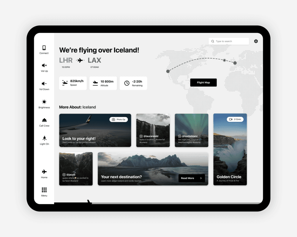
Geographical Based Recommendations: You’re flying over Greenland. Learn facts about Greenland. Watch a movie.
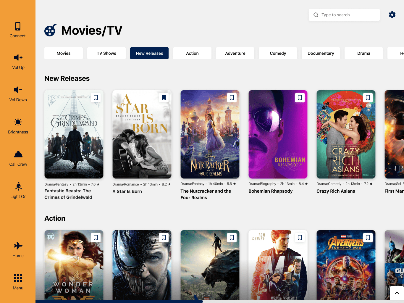
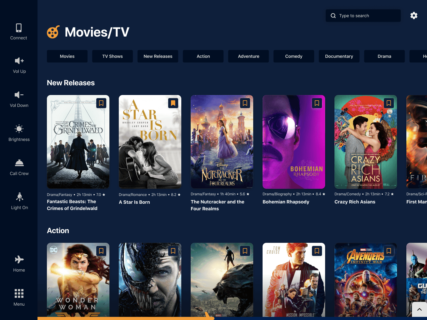
Branded Themes: The idea of a ‘universal’ IFE system probably wouldn’t appeal to airlines, as it will strip it from the brand identity. Having the option to apply brand customization to a monochromatic UI will create a consistent system in terms of flows and use, while still keeping the airline’s brand intact. It’s the best of both worlds.
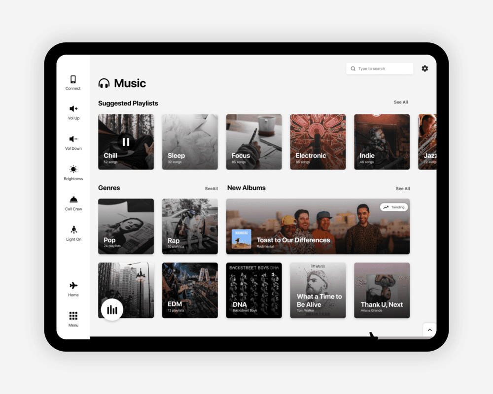
UI Solutions
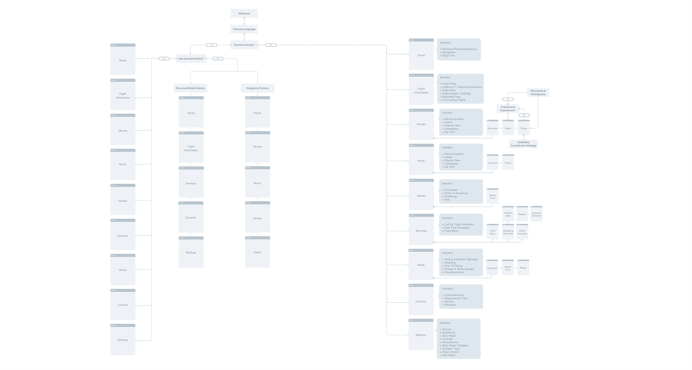
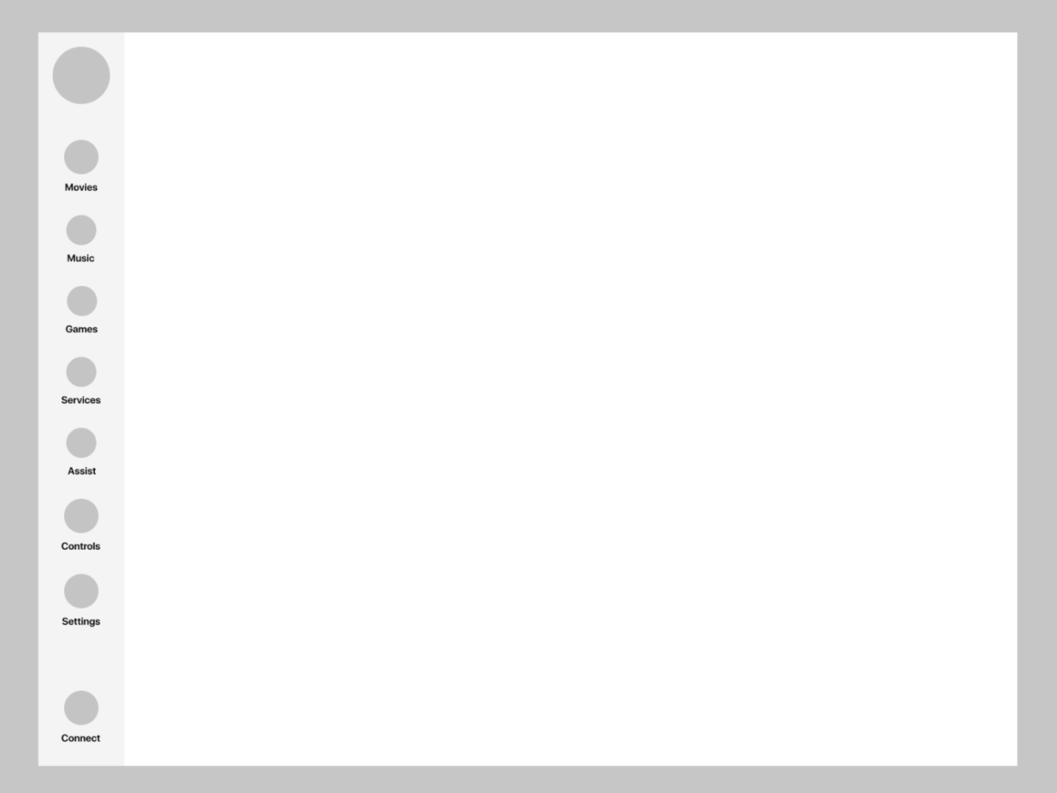
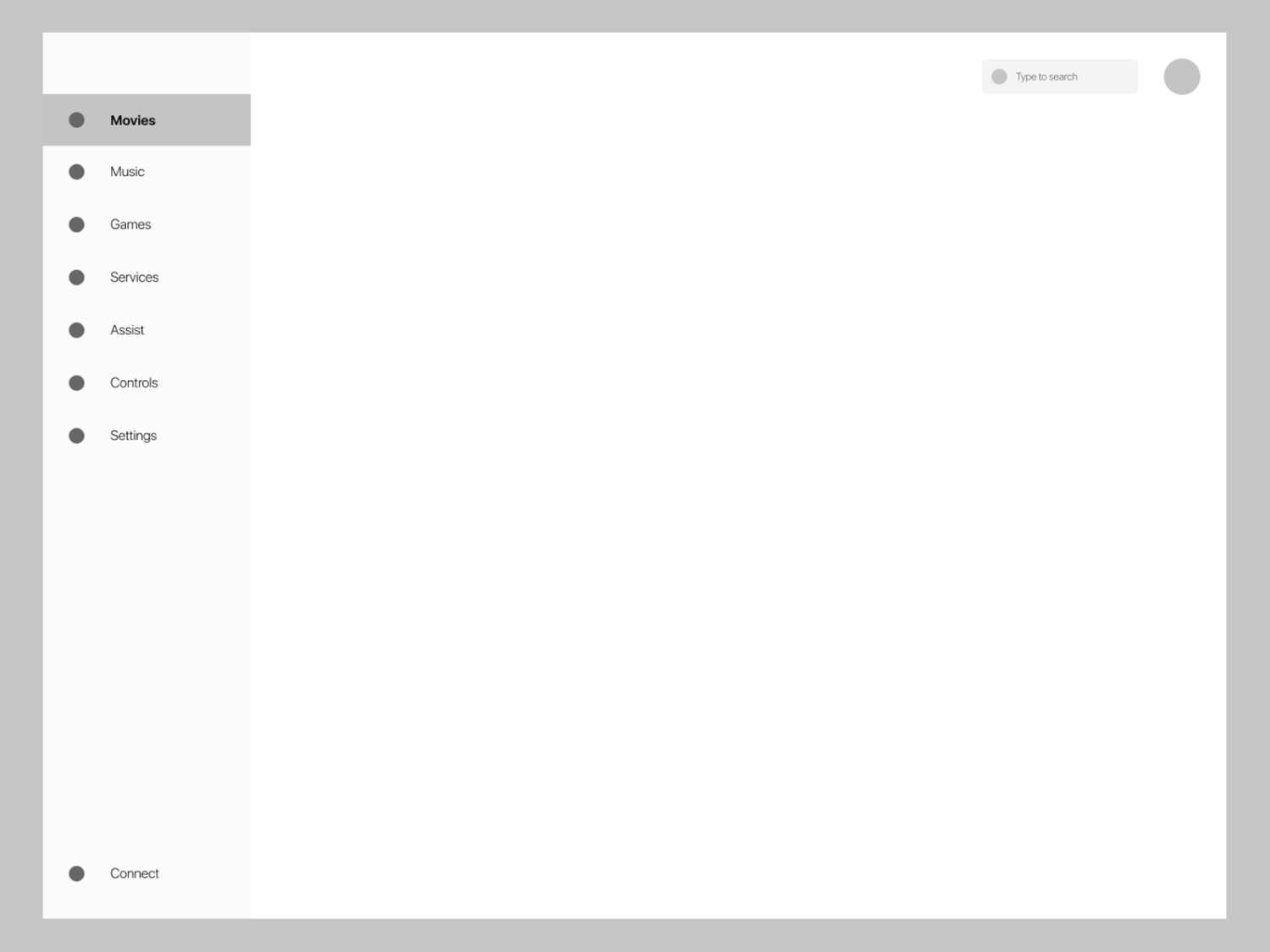
Global Navigation
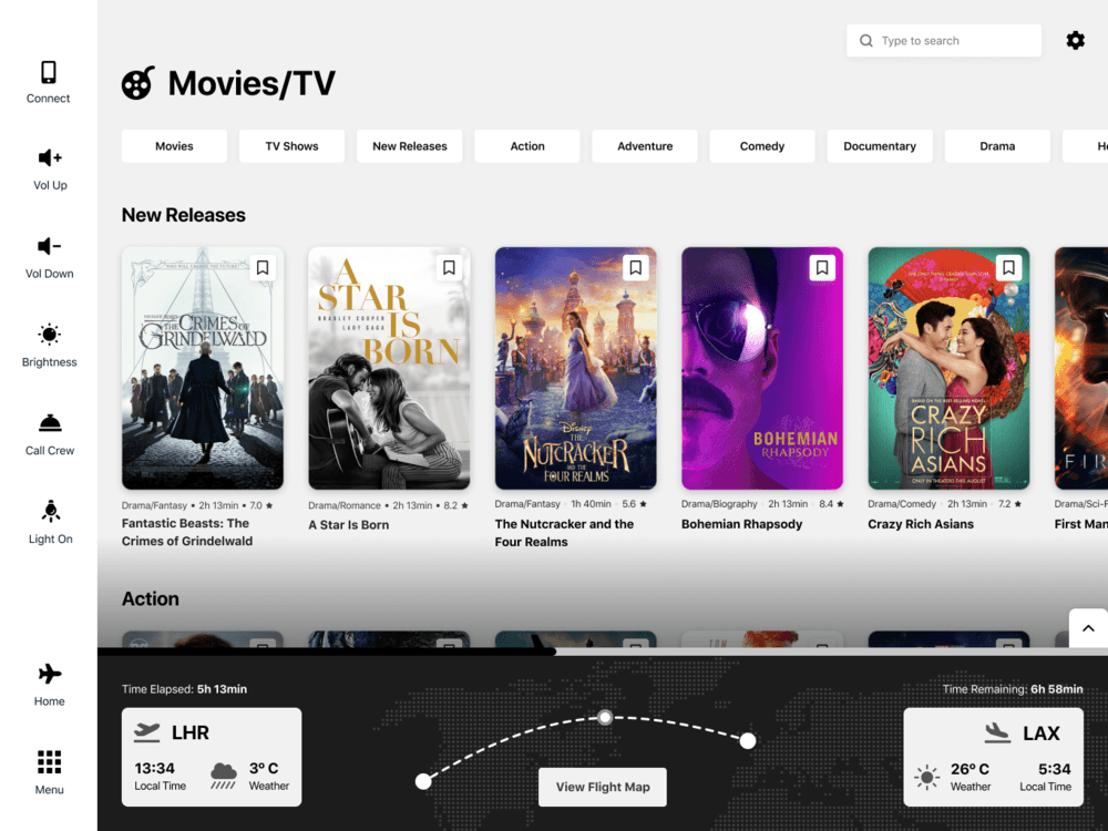
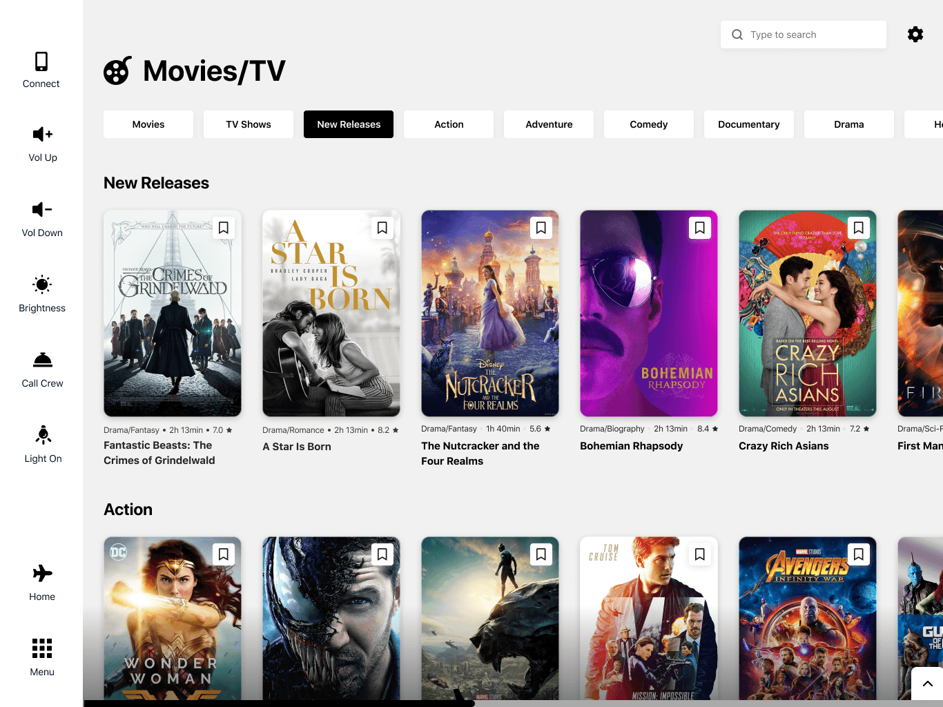
One of the biggest issues with existing IFEs is confusing, multi-layer navigations. Whether it’s a sidebar with 3 layers of nesting or a top and bottom tab bar or a dish mash of all of the mentioned, they put the user in complete discomfort - since the global nav is mainly used to navigate to your content or adjust the experience in a momentary need.
The first few rounds of iterations did look clean, but still used some type of nesting, which ended up taking way too much space on the screen. Another problem I encountered was that there were too many levels of alignment, which made the interface feel busy.
V1 Iterations
V2 Iterations
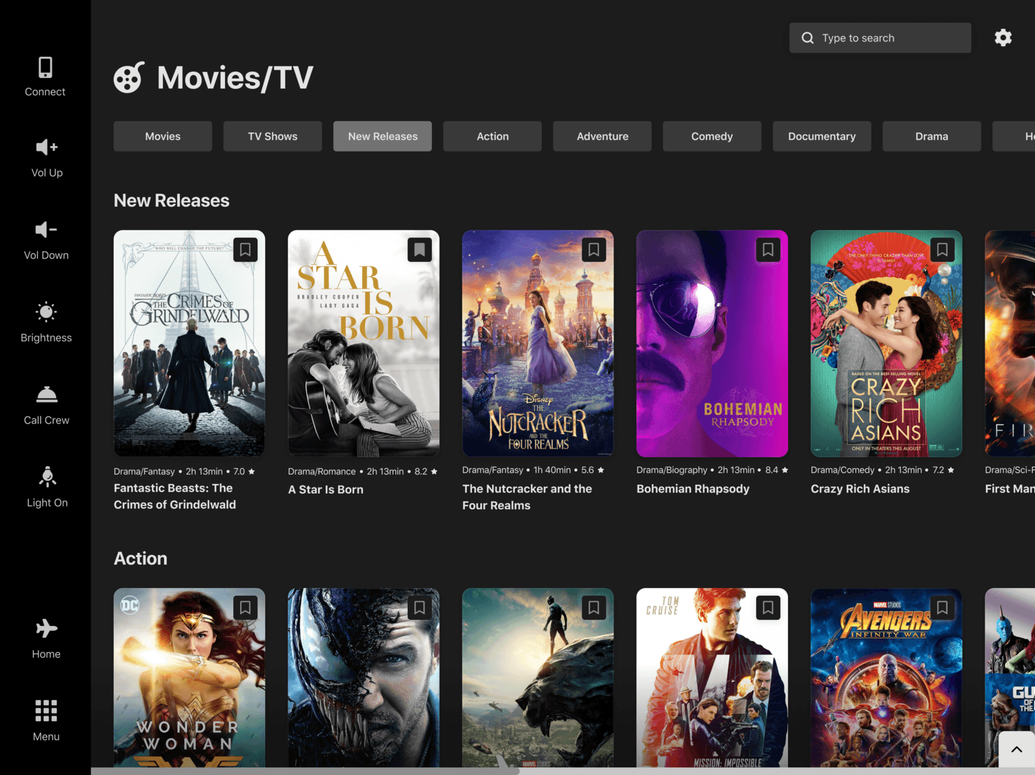
After a few more rounds of iteration and adding in content, I realized I didn't fully like any version, but I prefer the one that has bigger icons and a slimmer overall look. I put it against another screen I were simultaneously working on, to get a feel of what the design would look in context. I ended up going for a smaller horizontal secondary navigation, which not only took way less space but also was less intrusive to the other part of UI and had a visual consistency to the primary nav.
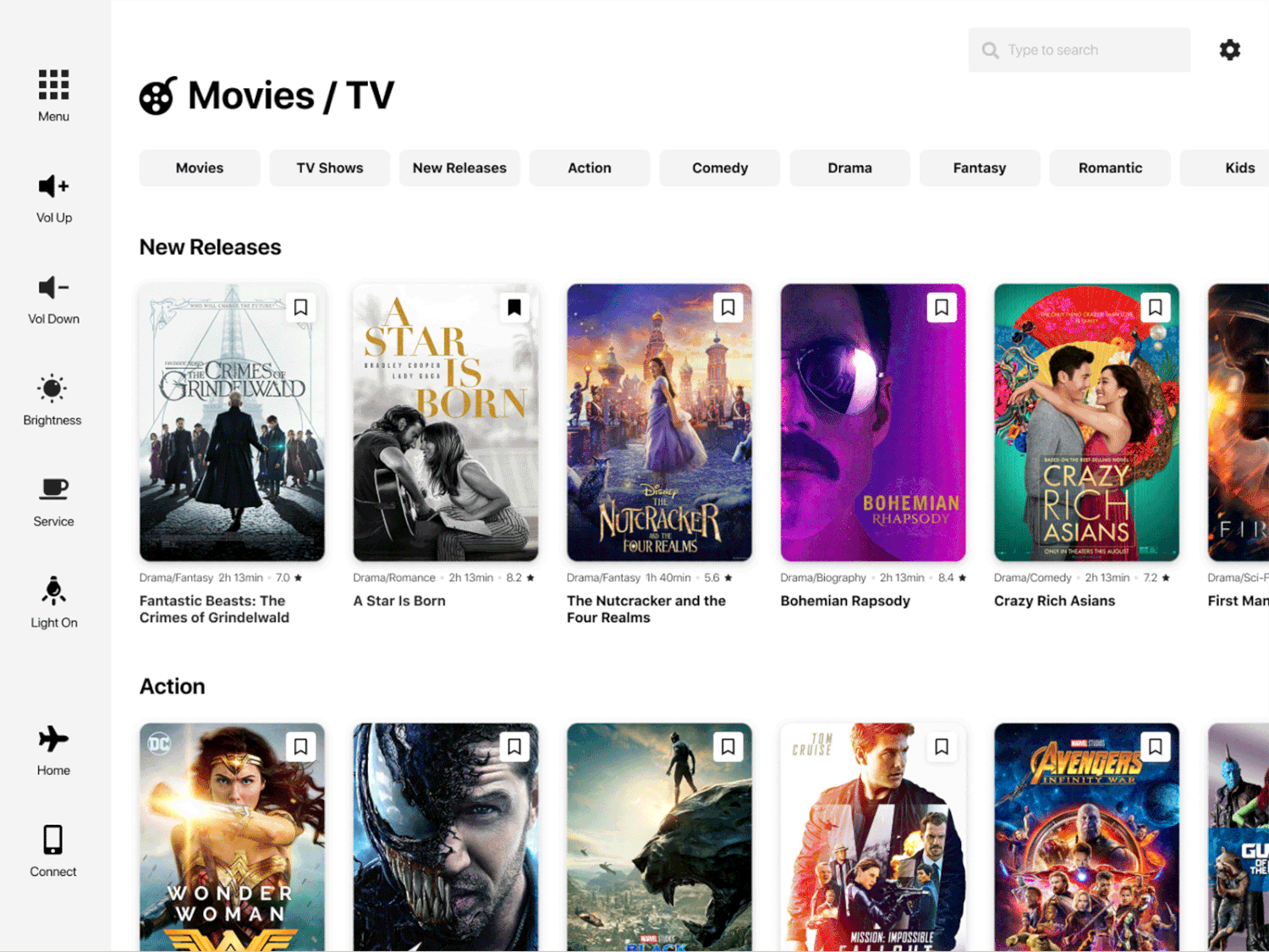
Development against the Movies gallery screen.
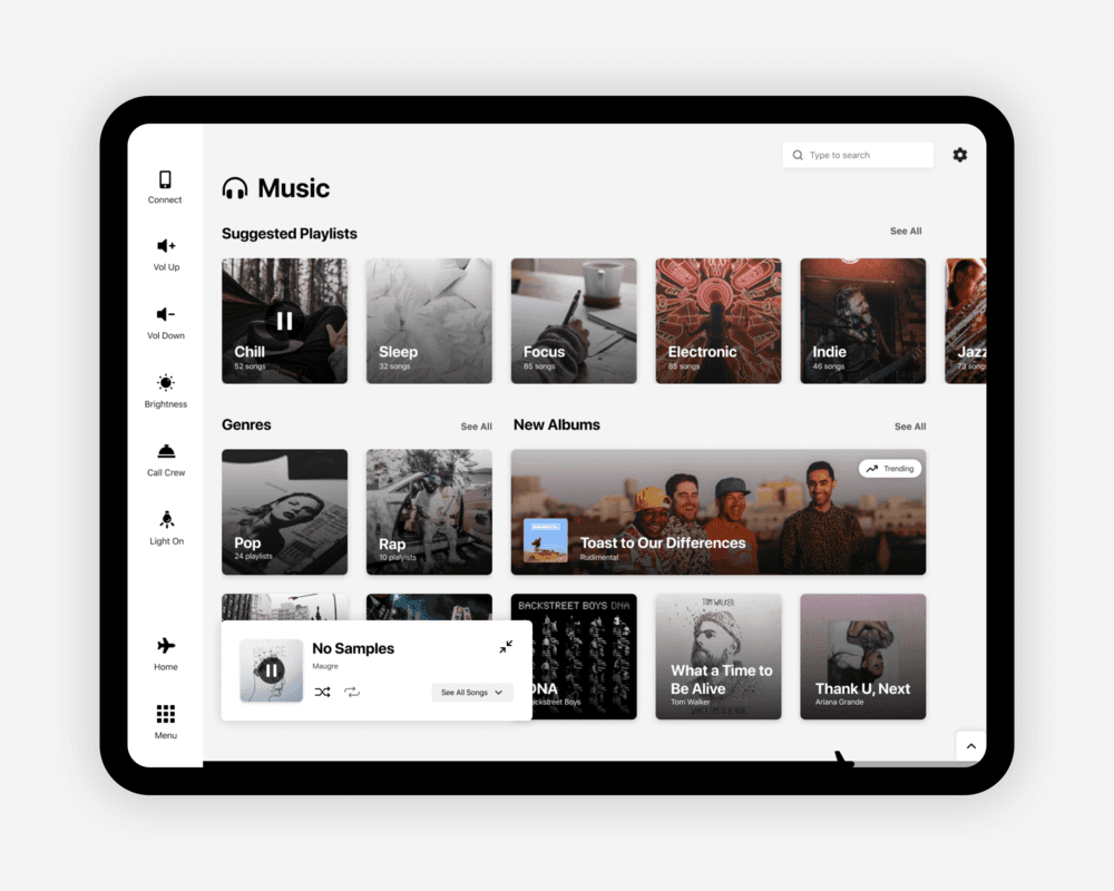
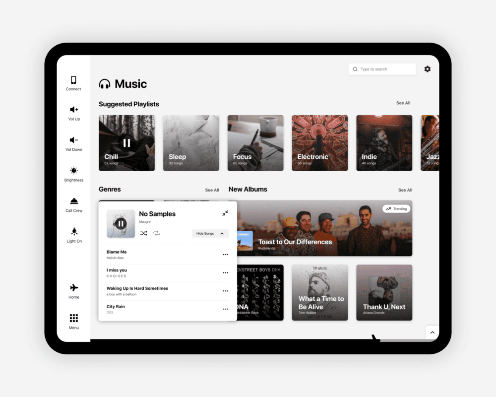
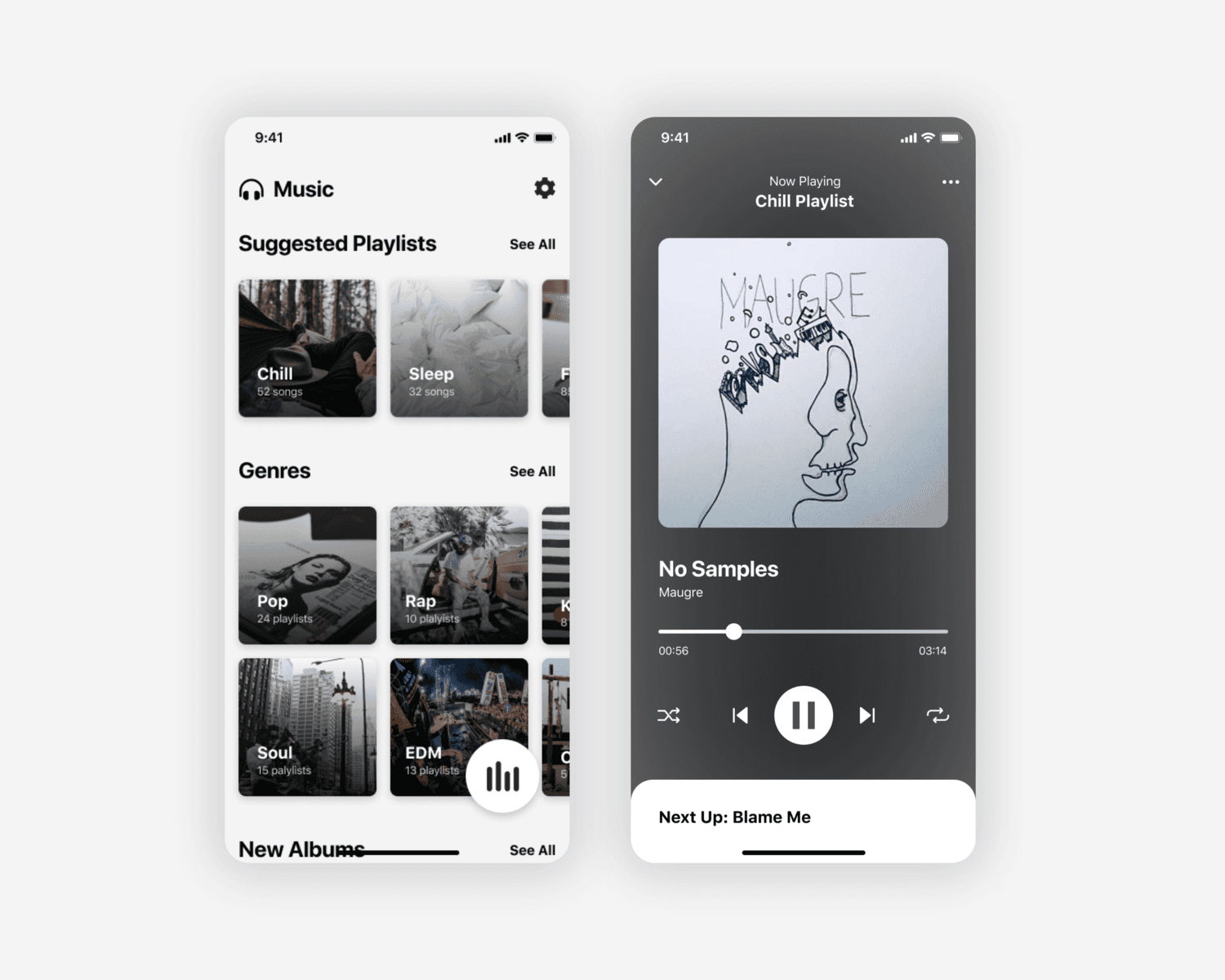
Mini Player
While designing the music page, I realized that the flight progress bar might open up a problem with having space for a music player. Due to project limitations and time constraints I decided it’s not wise to revisit the entire concept of the tracker, so I experimented with different ways of showcasing a music player. I tested both options that limit the user to listening to music only on that page and ones that are global.
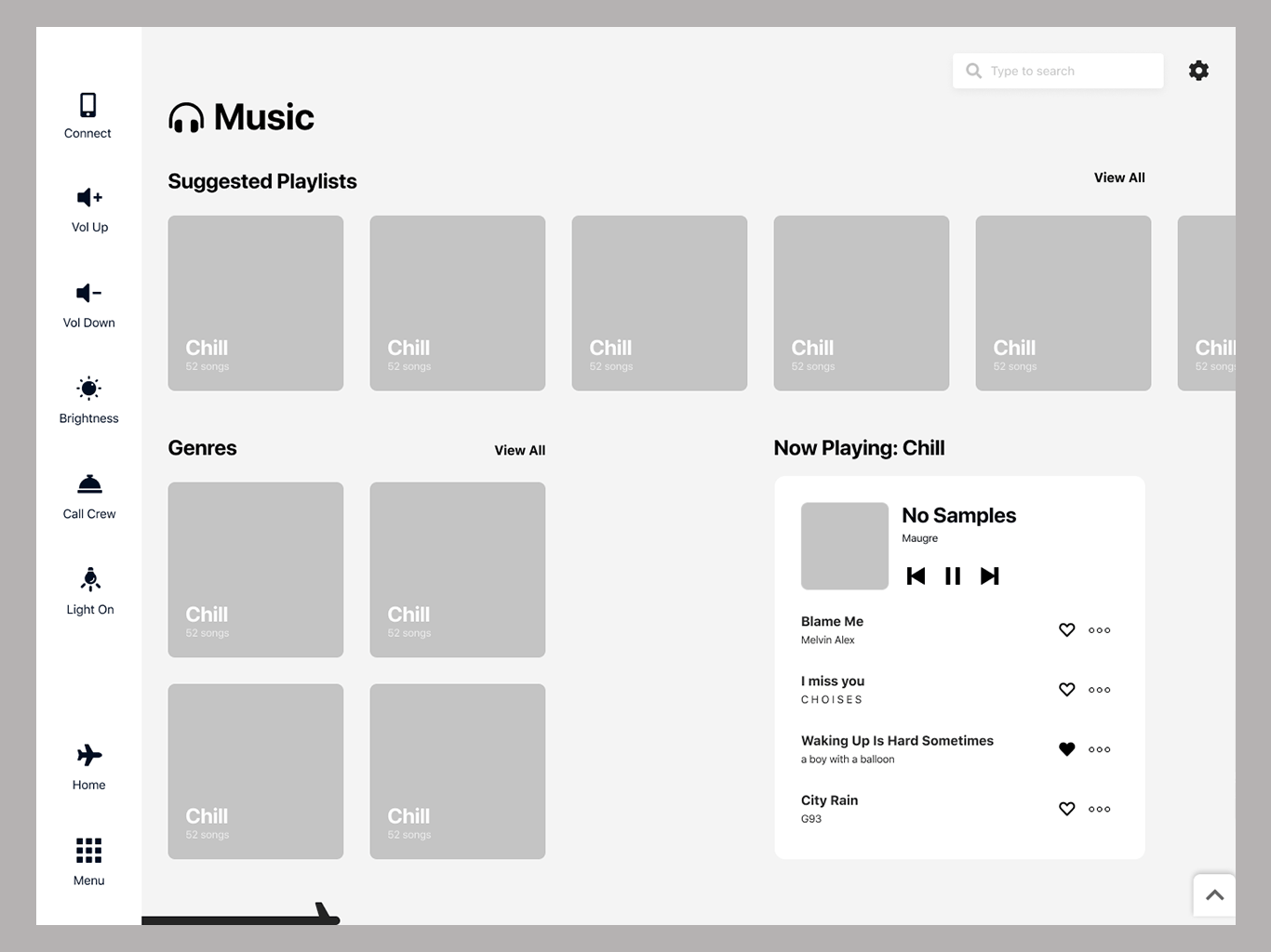
V1- Player inside the music page
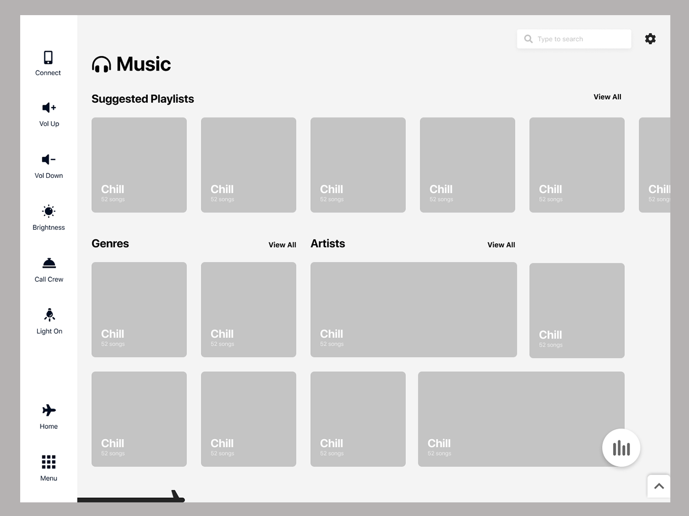
v2 - can be accessed from any page
After that initial iteration & a quick ask on an Instagram story, I made the decision to go forward with the mini-player concept - something I had initially seen being implemented at Shazam. It’s draggable, so the passenger can place it anywhere on the screen for easy access to the tracks they’re listening to. I did end up with 2 more sizes of a player, which can either let you immediately swipe between songs or choose a particular song from the playlist.
Mini Player
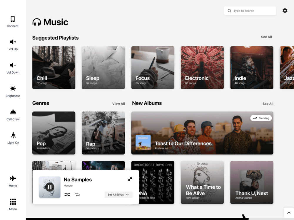
Small Player
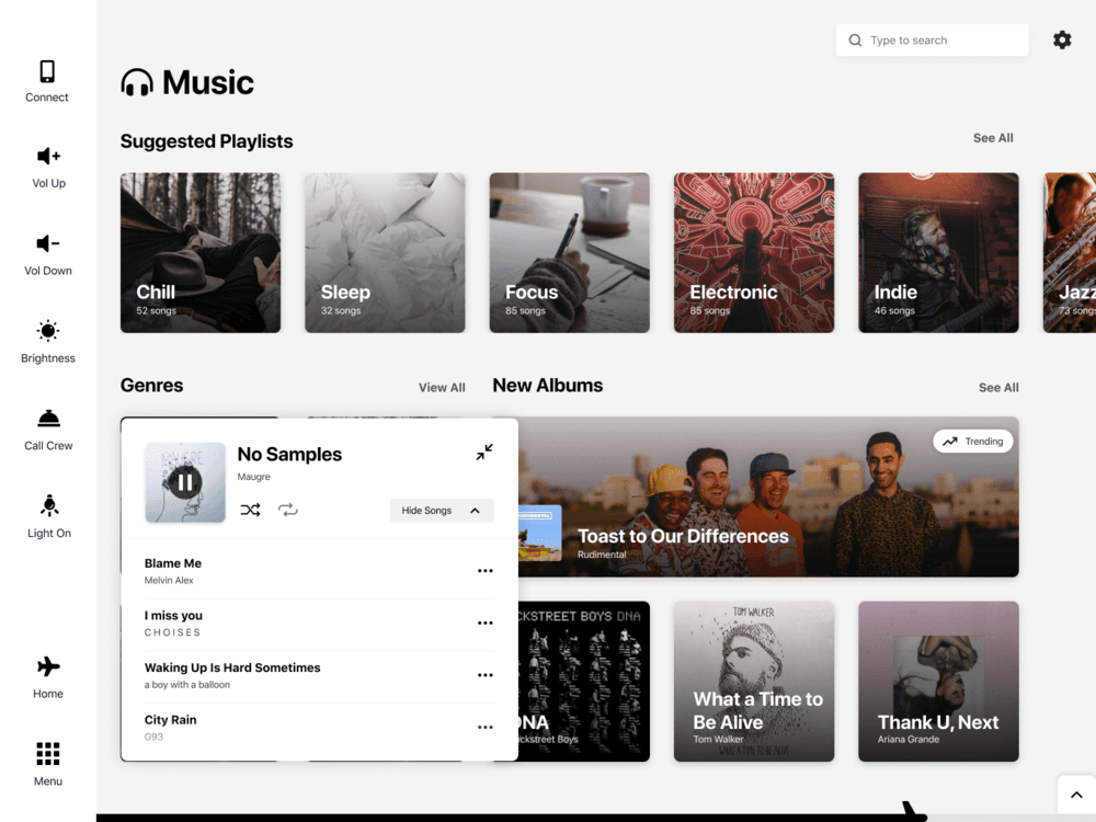
Large Player
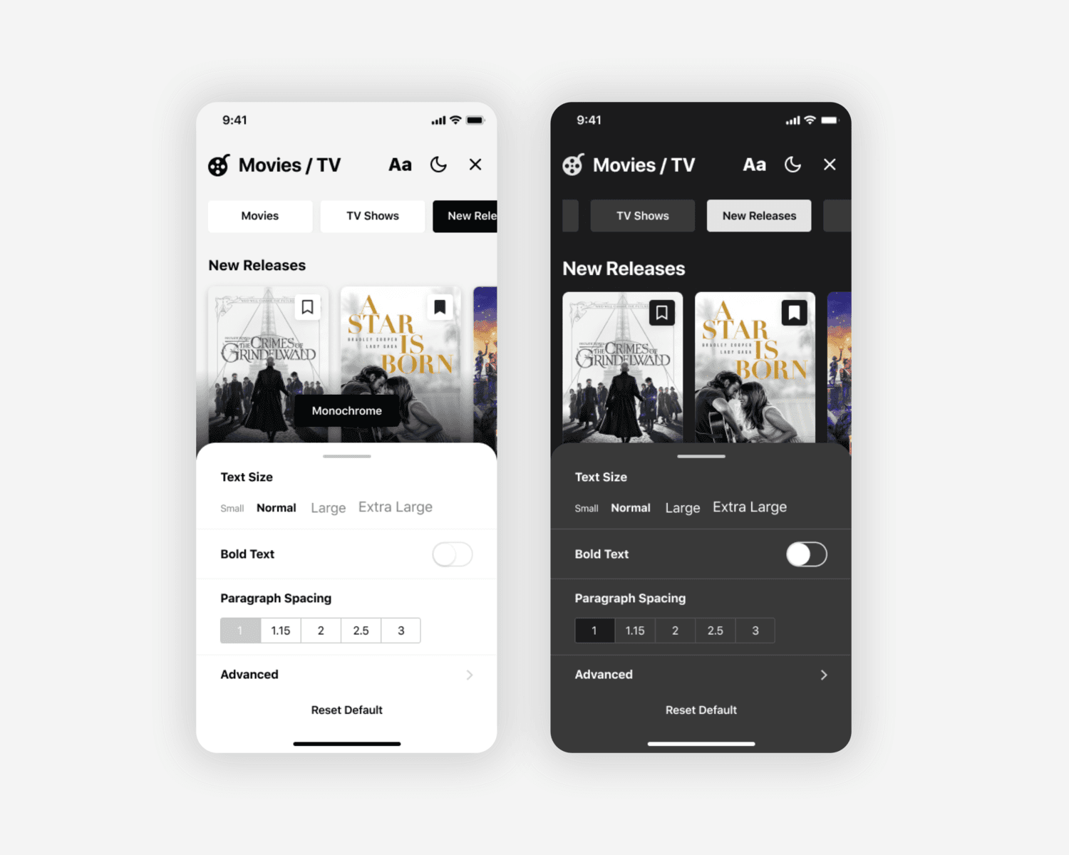
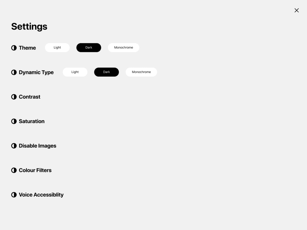
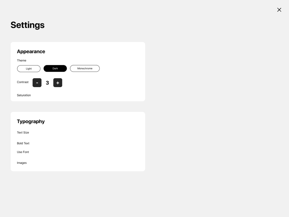
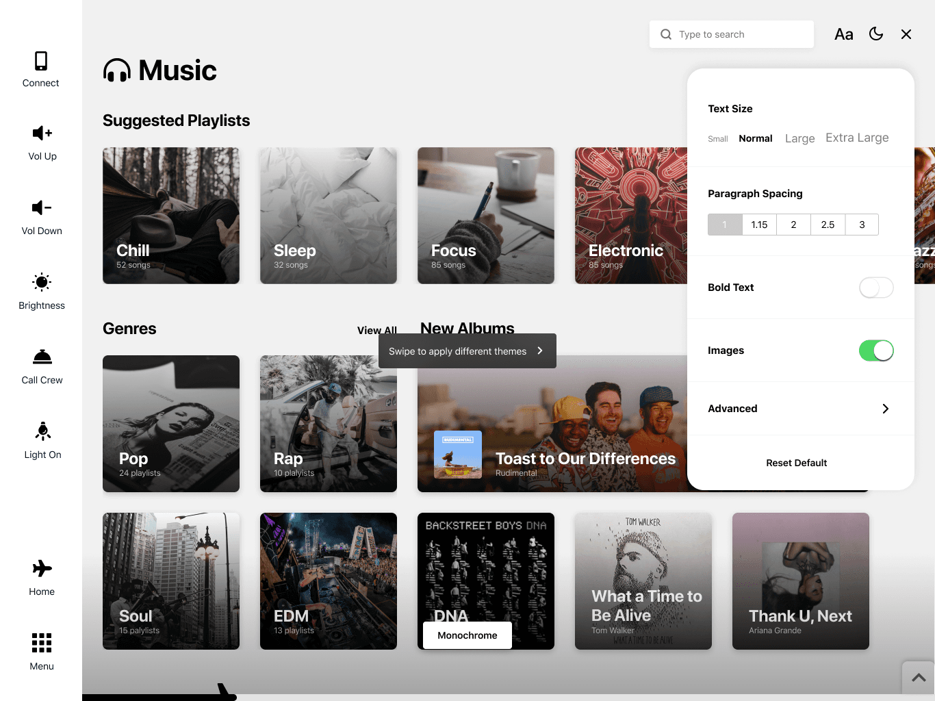
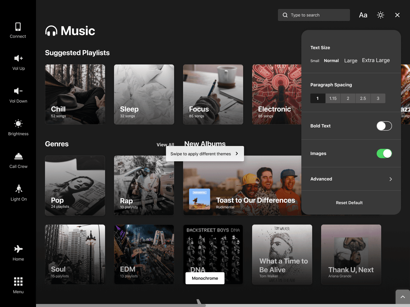
Settings
As I mentioned, nearly all current existing in-flight systems lack any accessibility features. I really wanted to try and do something that helps all people use the product, so I started learning about accessibility and ways UI can help different types of visual impairments. I also went through the WCAG guidelines head to toe to examine what needs to change in the design in order to meet them.
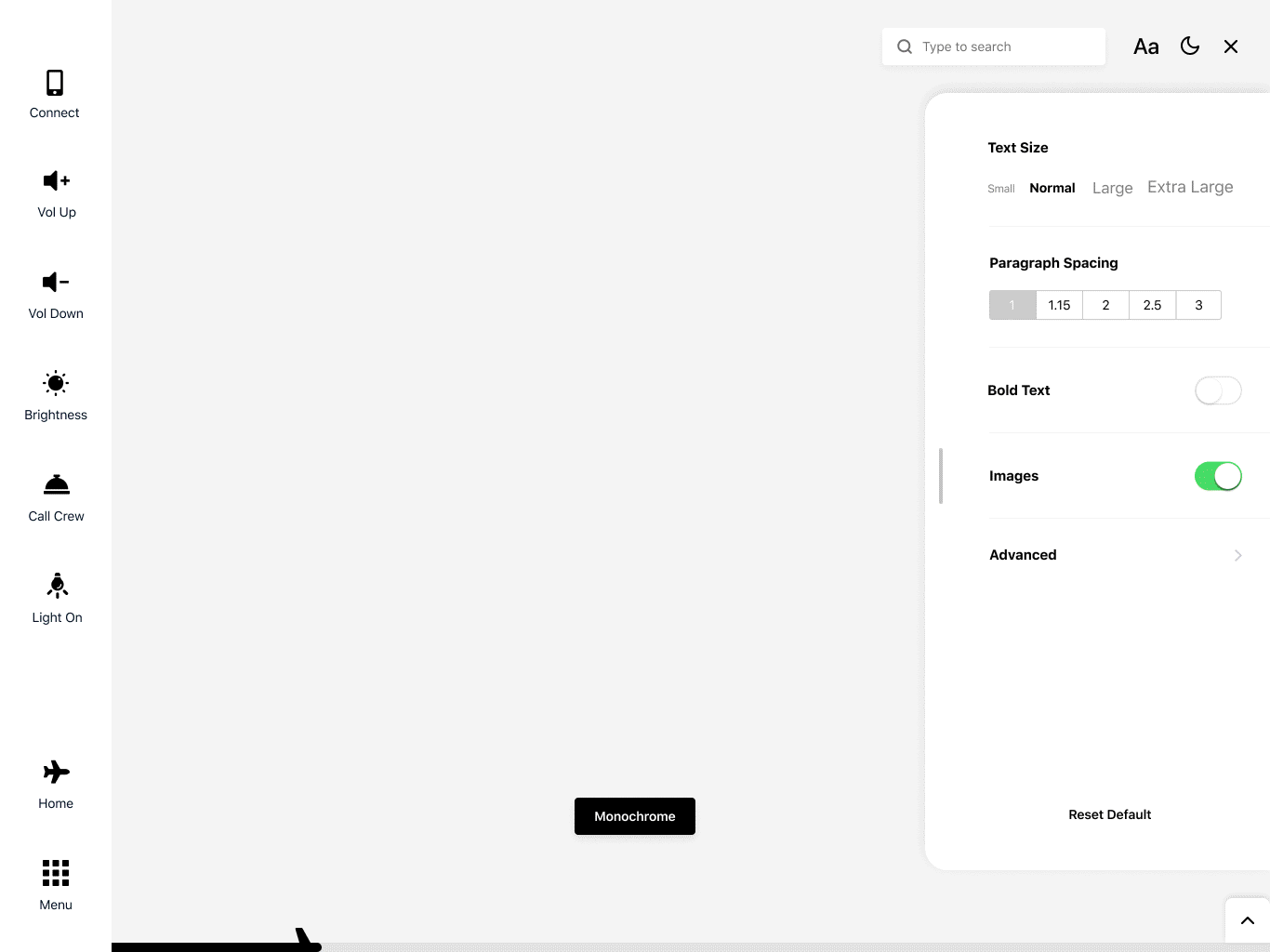
I ended up working around a settings page, which offers users more control over the way the interface looks - changing color themes, light and dark mode, typographic alterations, etc. For now, we've developed 2 main themes - Accent & Monochrome, however, they both have a day & night mode, totaling in 4 color variations available.
V1 - Fullscreen with a list
V2 - Exploring groupings
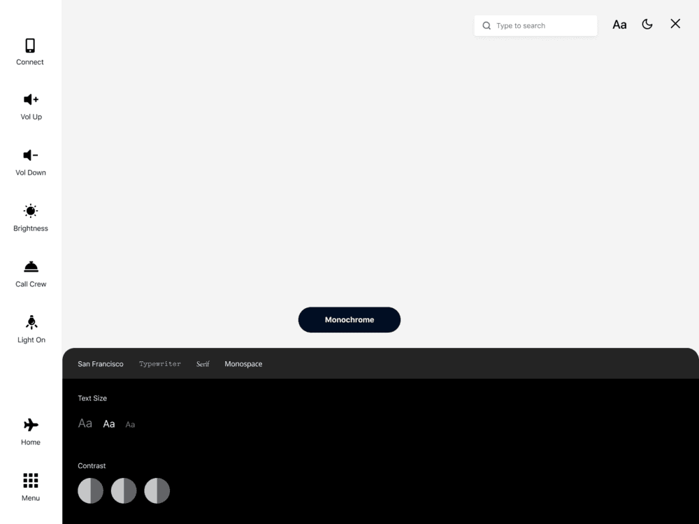
v3 - Bottom card
The first iteration did not look great at all and I found one big problem particularly with the first 2 options - a full-screen settings overlay does not allow the user to see the changes they’re making, which will be a pain. I liked where the 3rd version was going, but it wasn’t quite right, so I decided to push that forward and see ways I can fix it.
One thing that I needed to pin down was exactly what controls the app should be offering, so I started looking at what other apps use + reading a few case studies and compiled the most popular ones that fit the context of this product.
V1 - Fullscreen with a list
V2 - Exploring groupings
Both versions could work and I did personally like both of them, however, I did test the 2 designs with a few people and noticed the right panel was generally better perceived on the tablet. So I decided to move with that version, but keep the bottom card for mobile as a floating right panel won’t really work on a mobile device.
Light Monochrome
Dark Monochrome
Flight Progress Bar
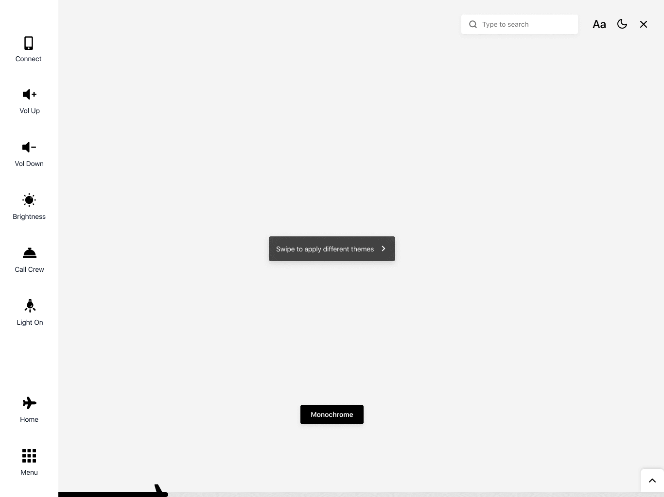
Looking at existing IFE Systems, one UI flaw that reoccurred was the way the flight progress/details were accessed. Usually, it’s part of the main home screen or is accessible on a separate page, which is often hard to access. Although I have decided to keep this information as part of the home screen as well, I decided to include a global flight progress tracker at the bottom of the screen which could be expanded to display full flight information.
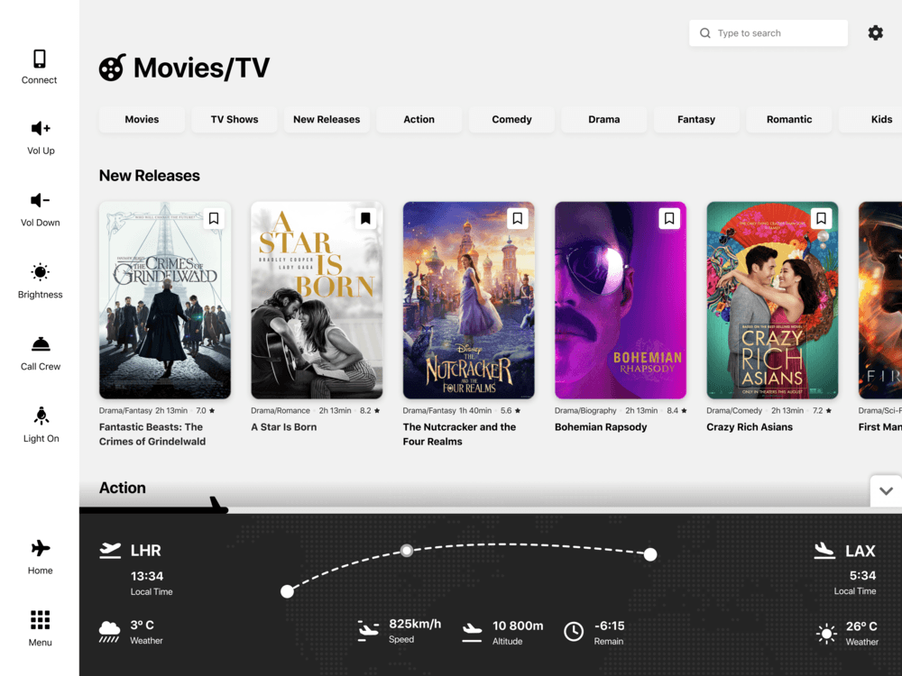
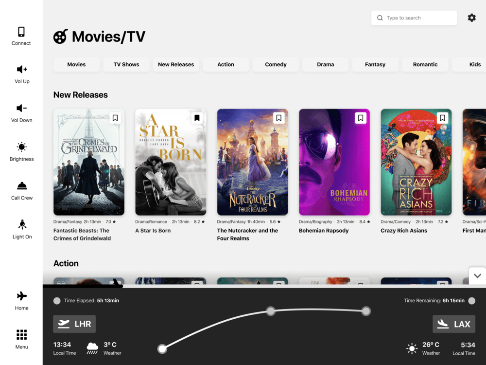
Our reference point for this was the top half of the Home Page I designed. During our research, I noted down the main information that airlines usually display for flight progress and worked off that to create the layout. Our only problem is how this would work on mobile - definitely not docked to the bottom, at least not the iPhone X/XS/R family, because of the home indicator which will overlap with the bar.
Notifications
Usually, notifications shown on airplanes are to inform you a verbal announcement is in process. I have found there are 2 main issues with that approach - not giving any context to the nature of the announcement can cause anxiety to passengers. Also having the announcement being delivered only through sound makes it difficult, if not impossible to get it across to people with hearing loss.
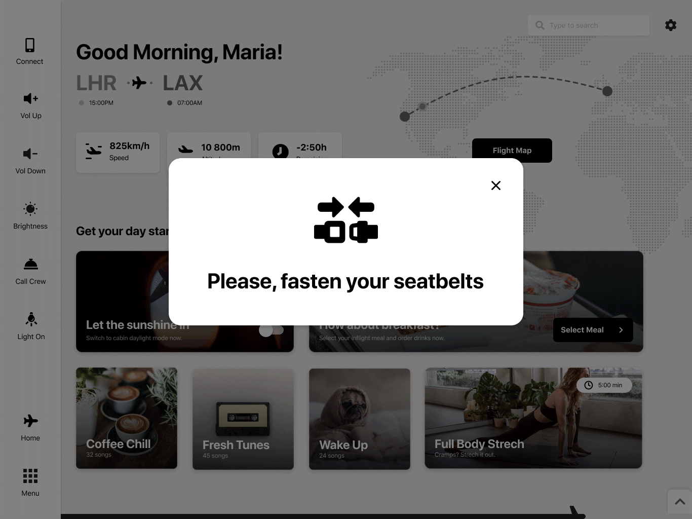
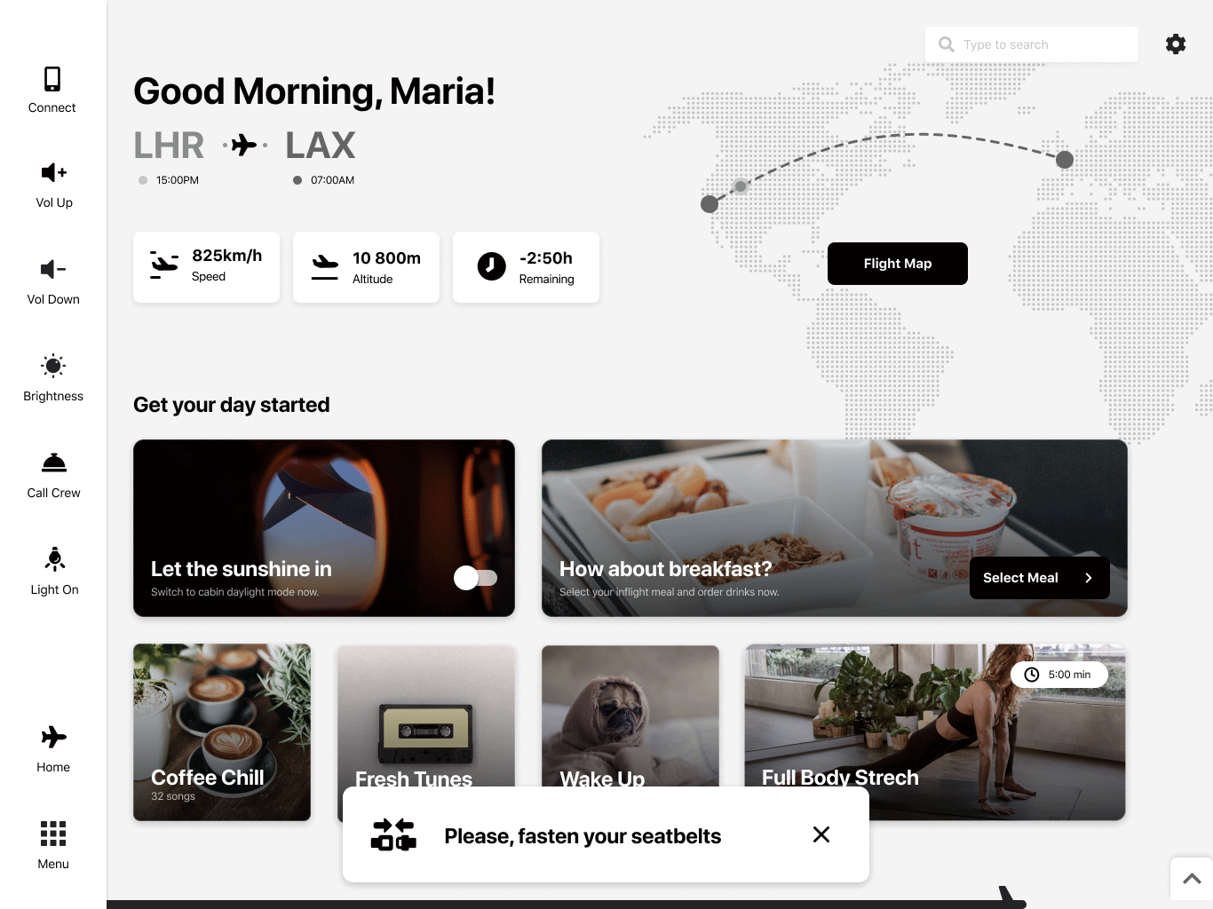
I explored a few visual styles and positioning for the notifications, but the one on the bottom of the screen felt the most natural. I also tested a few color variations, but decided to keep it black and white, unless it’s a high danger situation such as an emergency landing.
Color Themes
Part of the “universality” of this concept is thanks to the color theming that can be applied. When an airlines buys this product, they can apply their own fonts and brand colors to create an accent theme. Both the monochrome and the accent themes have a dark mode. Having so many theming options not only helps the brand make the interface their own, but also helps with legibility and accessibility for passengers with visual impairments.
Monochrome Light
Monochrome Dark
Accent Light
Accent Dark
Pages